Announcement

Collapse
No announcement yet.

Some cool 1.5 exclusive screenshots (**As seen on TV!**)

Collapse
X
 
  • Filter
  • Time
  • Show
Clear All
new posts

  • What shots in particular?

    You're right that it is essentially corridors dressed up as a town. That is a downside to fixed camera angles. Despite that, the layout of the city is pretty much fine, save for some odds and ends that are really only there because the background designers weren't that concerned about being 1:1 with reality.
    PROJECT Umbrella - The BIOHAZARD/RESIDENT EVIL Compendium

    Comment


    • Yeah that ending image doesn't look anything like Raccoon City - and it is never mentioned that it is. I'd say its NYC..
      Similar to the Perry novels (I know some people think there aren't relateable to the game, but I think they add some realistic stuff that Capcom never showed/told us about)
      where Leon/Chris have to commute to Raccoon.. I mean, not everyone who works there has to live there right..
      "I never thought any of this stuff my brother taught me would work!"

      Comment


      • Urgh, that was a painful slog. 6+ hours, 30+ saves, more deaths than I'd like to admit and a Grade F, but finally I've completed complete RE3 for the second time ever (and I used to be good at RE1&2 speed runs) and still hate it for the same reasons.

        Regarding the layout:

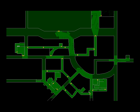
        - (UPTOWN) You've got the dent in the road that runs outside the RPD that shouldn't be there (legacy from the exterior wall built for RE2?).
        - (UPTOWN) The east end of the main road that runs past the front of the RPG ends in a T Junction of two smaller lanes. You wouldn't have that as this is a traffic flow bottleneck.
        - (UPTOWN) The curved road in the SE does't make sense for many reasons, from traffic flow to the fact that a unique road strucutre like that would probably have a single, important building at its centre.
        - (UPTOWN) The 45 degree angle road in the SW corner of Uptown would continue both to the North and the SE as it would pivot around the same point as the curved road mentioned above.
        - (UPTOWNAND DOWNTOWN ) The North / South road to the east of the RPD ends in a dead end in UPTOWN but this is a major road in the area, it would continue south.
        - (UPTOWN AND DOWNTOWN) The North / South road to the west of the RPD switches lane width 2 times as it travels south from Downtown to Uptown, beginning wide, then thin, then somewhere in the middle, and then it hits a dead end.
        - (DOWNTOWN) The east / west road that runs out the front of the Newspaper office and Gas Station would continue west through the Tram station and onto the road just west of the Tram station
        - (DOWNTOWN) Considering the with of the road that goes around the Restaurant, it would continue south through where the Sub Station is.
        - (PARK) The Hospital would be built in a way that forces an east / west road to turn into a north south road. A T Junction here would work, but not a 45 degree curve.
        - (PARK) The relationship between the cemetary and church

        Maps for reference:


        On their own, they're actually not important, but I believe that combined with some other layout choices, camera placement and a lack of medium to long range visual landmarks create a location that feels far too maze like and doesn't feel like a cohesive city and is less enjoyable than exploring the buildings in RE1&2 a result.

        That is a downside to fixed camera angles.
        The main limitation of fixed camera angles in the engine is how many of them you can store in memory at a time. A few less close ups and a few more higher up cameras (such as the approach to the gas station) could have helped frame longer roads whilst keeping the player in frame ok.

        I must add that I know how easy it is to complain about things like this on a forum and it's different when you're making a game and dealing with trade offs and ideas that will never be exposed to the public. If this is their first attempt at a City then it's far better than mine and I know some creative choices I've made in the past will haunt me forever.

        It's only because I loved the first two so much and was disappointed by the third that I scrutinize it to this level and if an old-school RE game of this calibur was released next week I'd already have a pre-order waiting.

        Roll on 1.5 & Behind The Mask!!!
        "Stories of imagination tend to upset those without one."

        Comment


        • It literally sounds like you're bitching just to bitch. How the hell can you be so bad at RE3? Stop being so anal about the layout of the city and enjoy the scenario instead.
          sigpic

          Comment


          • Well News bot DID request that out of him after all.

            Comment


            • At Jimmy Jazz .... actually the roads you mentioned that would 'run through' stuff like the tram is not true at all.. Look at the maps you posted. Use your imagination.

              For example, the road that is on the front of the Raccoon Press building would not go through the tram area - you can see that it ends at the Gas Station, at a T Junction.
              I honestly did not see any of these problems (relating to road layout anyway) in RE3 at all.

              I think some people are looking WAY too much into it TQBH

              Plus, for example the road carrying oon from the Grill 13 restaurant - nobody knows it would carry on straight, it could curve or have junctions.
              Not all the roads in Raccoon are grid-like and straight ya know =3
              (This is the exact same problem Silent Hill 1 had in the lakeside area, in regards to how Bachman Rd should fit alongside the river - from Old SH to the Lakeside area... people guessing and making maps which make no sense and don't fit in with the games designs)
              Last edited by RaccoonSurvivor; 07-28-2014, 02:37 AM.
              "I never thought any of this stuff my brother taught me would work!"

              Comment


              • None of those complaints are really negatives. It's intended to be maze-like rather than feeling like a normal city. The developers wanted something people would find familiar yet alien.

                The main limitation of fixed camera angles in the engine is how many of them you can store in memory at a time. A few less close ups and a few more higher up cameras (such as the approach to the gas station) could have helped frame longer roads whilst keeping the player in frame ok.
                Not quite. A lot of thought is put into the distance between the camera and the player in order to maximize feelings of distance or closeness to the action, and thus, directly affecting how scared a player gets. There's also the fact that having the camera so far away from the player makes it difficult to actually play since you'll barely be able to see the character. Raccoon City has tall buildings (like Raccoon Press, RPD, Apple Inn and a bunch of apartment blocks) but no skyscrapers. There's no real reason to show these tall buildings from the outside and it's particularly pointless with fixed cameras. You end up inside a few of them anyway and get a sense of their scale from there.
                PROJECT Umbrella - The BIOHAZARD/RESIDENT EVIL Compendium

                Comment


                • Originally posted by Chris' Boob View Post
                  It literally sounds like you're bitching just to bitch. How the hell can you be so bad at RE3? Stop being so anal about the layout of the city and enjoy the scenario instead.
                  Originally posted by RaccoonSurvivor View Post
                  I think some people are looking WAY too much into it TQBH
                  I was asked to list some of the layout issues I had in earlier posts so I did. As I've said before, it's a combination of issues with the city, not just layout, that mean I don't enjoy it and have covered the reasons why in other posts.

                  And my competence at Nemesis boss fights is irrelevent to the topic here Chris, but ultimately I can never get into the rhythm of them or the doge mechanic. I can breeze through the rest of the game though. It has also been 15 years since I've played this (I think I finished it once and never touched it again) and had to use a D-Pad to navigate a world (why didn't Capcom include analogue turning when it supported the analogue controller in RE???).

                  Originally posted by RaccoonSurvivor View Post
                  For example, the road that is on the front of the Raccoon Press building would not go through the tram area - you can see that it ends at the Gas Station, at a T Junction.
                  The T Junciton is the problem. It would be a crossroads and the tram aligned with the road. Roads are like water, you need a damn good reason to stop them.

                  Originally posted by RaccoonSurvivor View Post
                  Plus, for example the road carrying oon from the Grill 13 restaurant - nobody knows it would carry on straight, it could curve or have junctions.
                  Ingame it stops moving north because of the fountain / water feature there and there is no turn to the east there.

                  Originally posted by RaccoonSurvivor View Post
                  Not all the roads in Raccoon are grid-like and straight ya know =3
                  Of course not, and it's the same with cities in real life, but where they stray from the grid doesn't make sense in the way roads in real life would stray from the grid. It does beg the question though, why not embrace a full grid layout? There are only a couple of sections of roads (not alleys) that aren't perpendicular to the world and it would provide a greater geometric contrast between the roads and the alleys that join them without comprimising the gameplay or visual experience.

                  Originally posted by News Bot View Post
                  None of those complaints are really negatives. It's intended to be maze-like rather than feeling like a normal city. The developers wanted something people would find familiar yet alien.
                  The difference between intent and interpretation are the bane of everyone creative For me, and others here, it doesn't work.

                  Originally posted by News Bot View Post
                  A lot of thought is put into the distance between the camera and the player in order to maximize feelings of distance or closeness to the action, and thus, directly affecting how scared a player gets. There's also the fact that having the camera so far away from the player makes it difficult to actually play since you'll barely be able to see the character
                  Ah, when you said restriction earlier, I thought you meant a technical restriction Camera distance from the player is an important factor that needs to be balanced, I'm not suggesting that it pushed high up in the sky, but they already have some longer shots working well and using a few more of these could be used to show off larger areas without having to use more backgrounds (which take up memory) without making the game harder to play.

                  Originally posted by News Bot View Post
                  There's no real reason to show these tall buildings from the outside and it's particularly pointless with fixed cameras.
                  This, I do disagree with you on. It allows you to build up a mental map of how the city is laid out and how each area you are in relates to others. This allows players to become less reliant on maps over time and teases and rewards players for exploring and progressing.

                  The 32-bit era allowed gamers to explore much more realitically laid out and proportioned worlds for the first time, as many developers were building these kinds of environments for the first time in their careers, so of course they're not going to be perfect. I don't enjoy RE3 for lots of small reasons, rather than one big one, and many times, it's all the little things that seperate a great game from a bad one. You only have to look at how mechanically similar games in RE4,5, 6 & Revelations feel very different and divide fans based on lots of unique choices about environments, characters and gameplay.

                  I accept that I'm being anal in the amount of issues I'm finding with the layout, but I'm also being objective, not bitchy.

                  Now, is there a better thread we can migrate this chat too so that people aren't expecting to find 1.5 news and are then confronted by our RE3 chat instead?
                  Last edited by Jimmy_Jazz; 07-28-2014, 06:18 AM.
                  "Stories of imagination tend to upset those without one."

                  Comment


                  • That's what happens when people are bored because of a lack of news. yay!

                    Comment


                    • Haha, next up: the lack of toilet facilities in all Umbrella Labs
                      "Stories of imagination tend to upset those without one."

                      Comment


                      • And the police station. What about the hospital?

                        Comment


                        • JOSEPHHHHHHH!!!!

                          Comment


                          • Guys, this site on Resident Evil 1.5, I noticed the monsters section 1.5 of resident evil the presence of some of the monsters Especially the presence of the tyrant in 1.5

                            Comment


                            • I never know what to reply to this guy.

                              Comment


                              • Friends is not official but it seems that the restoration of jueo was canceled and so there is no news about it will you?

                                Comment

                                Working...
                                X