They already decided that desing so its pointless to keep discussing about that
Announcement
Collapse
No announcement yet.
Some cool 1.5 exclusive screenshots (**As seen on TV!**)
Collapse
X
-
They fixed that already as seen in the picture. But I still have no idea why the surface isn't flat under the stairs. This design makes absolutely no sense and you'll probably never find concrete stairs that look like that in a building decades old.Originally posted by TableSet View PostAnd then how the handrails are too shiny.
It's a little detail but it breaks immersion.
Comment
-
Yeah, the underside of the staircase makes no sense. If it had the appropriate backbone, it would block the view of the door from that angle. Therefore, it is the angle that should change.Originally posted by Rick Hunter View PostThey fixed that already as seen in the picture. But I still have no idea why the surface isn't flat under the stairs. This design makes absolutely no sense and you'll probably never find concrete stairs that look like that in a building decades old.
It's a little detail but it breaks immersion.
Comment
-
But common where? I've never seen it. Also, why would one set of stairs be normal and another be like this? The architect isn't going to apply multiple designs for basic things such as stairs in the same building. We would also have to define what modern means, the game is nearly 20 years old, and the building was older than that.Originally posted by The_Wes View PostThat design of staircases is common.
Comment
-
The design is not super common, yet it's nowhere anachronistic, unrealistic, or whatever. Please stop trying to nitpick every single style choice, it's not like CAPCOM never tried that anywhere.
Resident Evil: Behind the Mask twitter, also in Facebookian flavor for great justice.
Comment
-
That's the point, we're talking about style choices. You don't need to make things up when you already have a design canva for the base game, a known esthetic. I bet everything you want Capcom would have used a similar style between those two sets of stairs, and wouldn't have used some kind of strange design just for the sake of making something different.Originally posted by Gemini View PostPlease stop trying to nitpick every single style choice
I don't think the game needs some kind of personnal design touch when there is really no need to do that. Maybe it's nitpicking, maybe not. But when it comes to immersion, I think it's a pretty big deal. It contributes to the overall identity of the game. An ugly and bland looking set of stairs probably fits much better with the overall aesthetic of the game.
Comment
-
A simple detail doesn't change anything with immersion, it has barely anything to do with that at all. Most people don't even bother looking at the backgrounds, they play the game instead. It's the same thing happening with REHD: the backgrounds are filtered like crap, still you're barely paying attention while moving around. Actual immersion is really something else.Originally posted by Rick Hunter View PostBut when it comes to immersion, I think it's a pretty big deal.
Resident Evil: Behind the Mask twitter, also in Facebookian flavor for great justice.
Comment
-
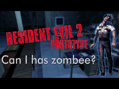
I really like the music playing in this video. Is this one of the new tracks for 1.5?Originally posted by Unmasked View PostMe too, but sincerely i dont expect much to explore. The actual build we have by itself is so unestable. Imagine an earlier one. Maybe only has a few rooms explorable and nothing else: the first lobby, the mansion-like irons office.
By the way, Gemini uploaded that. With this he's not only fixing bugs for 1.5 zombies, he can use later those re2 for Behind the Mask so, two birds with one stone. Good work dude sigpic
"Must the State continue to exist once the question of labor and capital shall be practically solved? We reply in the negative. We are anarchists."
Comment
-
It's nit picking and its perfectly fine.
For what has been shown to us for a work in process of course your gonna get a comment here and there. Don't like it/don't find logic in it? Then disregard it. What? Would you rather have just empty praises? Yes, a lot of it DOES look good. However some of us would like to help/contribute to the best of our power, however little that is.
Comment


Comment