Announcement

Collapse
No announcement yet.

RE4 GC - PS2 Comparison

Collapse
X
 
  • Filter
  • Time
  • Show
Clear All
new posts

  • RE4 GC - PS2 Comparison

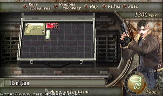
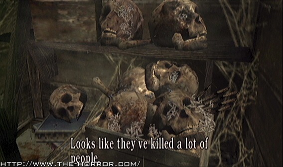
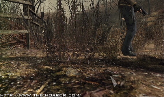
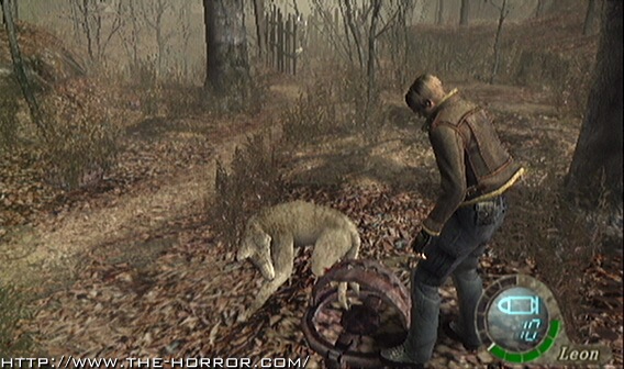
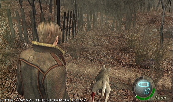
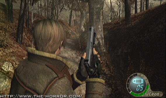
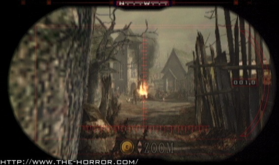
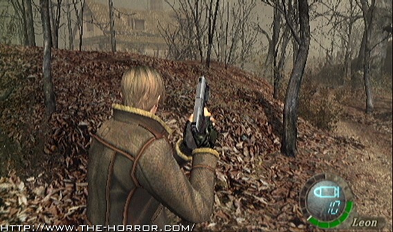
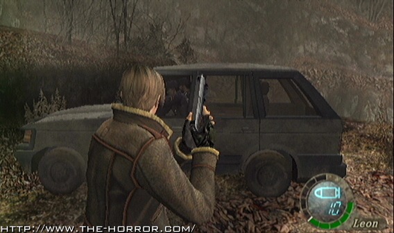
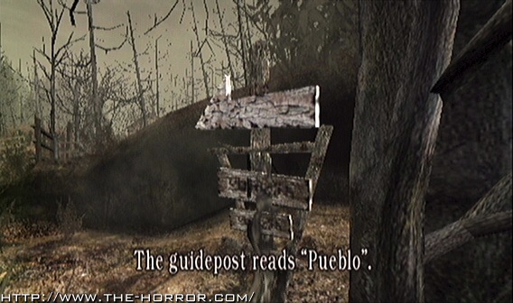
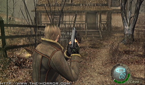
    I decided to get some comparison shots myself since the Rhuliweb ones werent exactly dead on. Youll notice drastic changes in not only the landscape, but the lighting, modeling, textures and color palletes as well. Lets just hope this puts to rest all the "Graphics are the same" claims we have been seeing all over the place.

    You can move your mouse over the image to load the PS2 version. By default, all the images are on their Gamecube versions.

    I cant be sure however it looks like the PS2 version is actually running in a resolution closer to 320x240. Again thats just speculation on my part but its what the game appears to be running in. All comparison shots were taken by myself with both games set to the same exact brightness level.
    Loading Image...


    Loading Image...


    Loading Image...


    Loading Image...


    Loading Image...


    Loading Image...


    Loading Image...


    Loading Image...


    Loading Image...


    Loading Image...


    Loading Image...

  • #2
    its nothing we already didnt't know is it dot, i mean we all know lighting and textures can no way be as good as in the GameCube, but capcom i think have done the best they could possibly have

    Comment


    • #3
      imo the ps2 version looks better in the backrounds in some of the screens...i cannot wait! only 8 more days!

      Comment


      • #4
        As a PC enthusiast Im very interested in seeing what drivers affect the visuals. I just thought that a good comparison with the exact same spots was lacking. I dont have an agenda here, Im just showing the public what I can on these slow news days.

        Evo, your probably liking them because of the visibility. Further distances are seeable since the PS2 isnt doing the fog included in the GC version.

        Comment


        • #5
          I still find it interesting that all the foliage was remodelled for the PS2 one. The shapes are more drastic also. Actually looking at it now the reason the tree shapes have more love put into them is that there are far few. I guess they removed a lot of them in order to have some really good ones. Also interesting the way they went around altering the lighting in order to drop the fog. The game looks great on PS2 still but I think allot of the atmosphere is definitely away.

          I wonder how long Mikami and co spent on getting that washed out look of RE4 just right, I would imagine awhile seeing as the PS2 one is just a tad too washed out.

          I think these are much better comparison ones myself than the ones that where on that other site. I reckon they where taken from one of the demos rather than the final build. Will you be doing a comparison of the final PS2 game dot? I ask because there is a few week inbetween US/UK release.

          Comment


          • #6
            That comparison is the best I've seen. Great job Dot.

            Comment


            • #7
              Minor update, but while scouring the disc I came across the Title Screen sound file for Seperate Ways. Dl is here (Save target as).

              Comment


              • #8
                GC version wins in ground graphics, PS2 wins in light.

                Comment


                • #9
                  Heh... Funny how they dropped SO many poligons for the PS2 version. Looks like they had to change animations because of that too (Note Leon's butt in the picture with the dog...).
                  The tree models/textures are extremely less detailed also...

                  BTW, you using componant for the GC or just S-Video? Cause the PS2 screens are much 'clearer' when it comes to that... I know GC Componant cables are pricy and can't be bought in stores (Far as I know).

                  Comment


                  • #10
                    Used component for both. I think you might just be noticing the fog and higher color pallette. The PS2 is "washed out" possibly because it is running at something like 480x???. BTW I got something exciting to talk to you about, Lets just say THIA made screens at higher than 640x480 resolution (True resolution too!)

                    Comment


                    • #11
                      why dont you make proper "side by side comparison" shots of the same area's, like ruliweb did.

                      Comment


                      • #12
                        This one is like Ruliwebs but is better. Mouse-overing really makes it easier to compare the screenshots.

                        Comment


                        • #13
                          oh DAMN NOW I GET IT LOL

                          god damn im an idiot lol, roll over the mouse to see the other image :p

                          Comment


                          • #14
                            LOL! I was gonna say WHA??!?! Haha I made it so easy! Be sure to read the posts heh ;)

                            Comment


                            • #15
                              now that i noticed the thing i have to admit its a much better comparison method then ruliweb

                              Comment

                              Working...
                              X