Announcement

Collapse
No announcement yet.

Resident Evil 5 Boxart, Five RE5 Screens, 1UP Previews RE5

Collapse
X
 
  • Filter
  • Time
  • Show
Clear All
new posts

  • Resident Evil 5 Boxart, Five RE5 Screens, 1UP Previews RE5

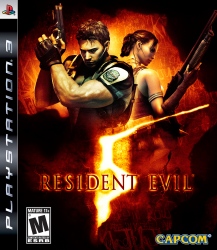
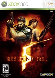
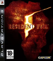
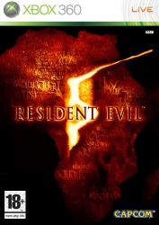
    Capcom Unity's Snow has updated his blog and put up the final official box art for Resident Evil 5. We've also added the European boxart for your viewing pleasure.


    Resident Evil 5 Boxart thanks to Zombie

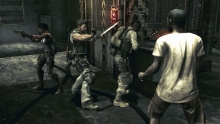
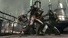
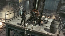
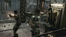
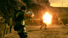
    In other news, here are the latest screenshots which Capcom just released in their full resolution:


    Finally, 1UP have recently put up a brand new preview of Resident Evil 5 with information on the single and co-op mode. Check it out here.
    Last edited by Dot50Cal; 12-18-2008, 01:03 PM.

  • #2
    Haha, I was just going to post this.

    Comment


    • #3
      PS3 is much better! Lol

      "run's away"
      Last edited by Ra1DeN; 12-18-2008, 12:39 PM.

      Comment


      • #4
        Gosh! in that boxart should be Jill instead of Sheva!

        Comment


        • #5
          Wow, sexy case.
          LOL JillLover.
          Last edited by Gradon; 12-18-2008, 12:41 PM.

          Comment


          • #6
            I like the boxart anyway xD

            Comment


            • #7
              Africa's layout on the back with (what appears to be) Kijuju written is pretty cool! I also like the 5 in RE.
              sigpic

              Comment


              • #8
                Added the European versions ;)

                Comment


                • #9
                  As "generic" as it is to add the action hero pose on the cover, I think the US box is better for having it over the European one.

                  Comment


                  • #10
                    Yeah, I gotta agree with Rombie on this one.

                    Comment


                    • #11
                      i don't really like it that much, it's meh, it doesnt scream EPIC or scary like RE3 or RE4's PAL covers do, they could do a lot better, i saw better fan art.


                      i wonder what the PAL cover will be like though, they ussually get great covers.
                      Last edited by missvalentine; 12-18-2008, 01:11 PM.

                      Comment


                      • #12
                        The european cover is just lazy.

                        Comment


                        • #13
                          looks pretty good the ps3 version is totally the best one

                          Comment


                          • #14
                            The American cover is much better.
                            sigpic

                            Comment


                            • #15
                              its always the same. The PAL version of RE1, Zero, 4 have all been this minimalistic stance, even Dead Aim had nothing on its front cover!

                              it looks good though, the use of the african land mass is a nice touch.

                              Comment

                              Working...
                              X